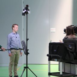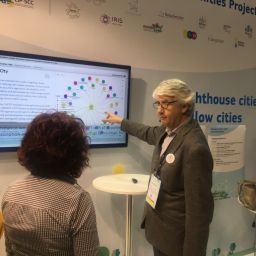
The final version of the MAKING-CITY stakeholders’ map is now ready and it’s time to play with it! Setting up by partners involved in the Work Package 8 – Collaboration with other Smart Cities and Communities (SCC) projects & networks, this map was presented at the SCC1 at the 2019 edition of the Barcelona Smart City Expo, in the form of a continuously running video at the SCC1 stand. Moreover, this final version results of the collaborative work held with the communication coordinators of each project within the SCC1 Framework, who have reviewed the data collected. Most of the seventeen projects have verified and communicated changes regarding both the project and stakeholders description and its assigned category.
Why this stakeholders’ map?
Collaboration is always seen as very desirable: collaborate can help us do our work better thanks to what we can learn from others, and/or thanks to the work done with them (“doing work with” by the way is the exact etymological meaning of collaborate). Nevertheless, devoting time to collaborate does not usually happen as much as it should, because of a very simple reason: we are too concentrated on our own work to have time to look around. So, any step to reduce the difficulty to look around should be welcome.
Collaboration certainly involves much more but one of the first, most necessary steps to collaboration is to have a clear view of what is around us, which in our terms means knowledge space, specific capabilities, geographic distribution, projects and initiatives anyone is participating at, and maybe even more important, where you are in relation to the whole system. Here is where this map comes into scene: to help the different Stakeholder’s of the SCC1 framework to identify and acknowledge other agents of the system and enhance synergies between them.
In the framework of WP8 in the MAKING-CITY project, we have defined a series of collaboration “orbits”.
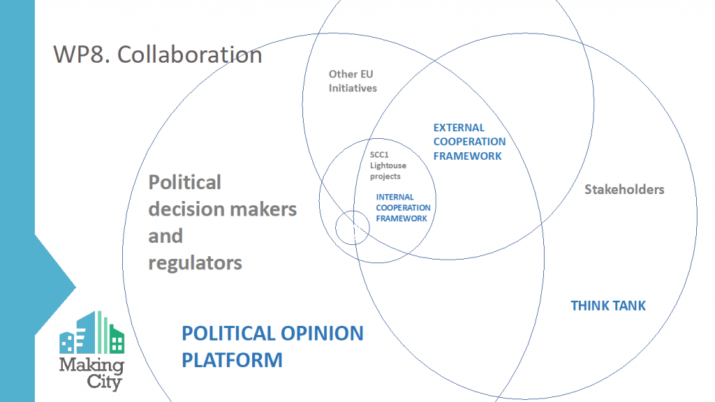
The “orbits” defined in WP8 of the MAKING-CITY project.
It is true that collaboration starts within the MAKING-CITY project itself, but collaboration starts making true sense when you refer to all the SCC1 projects and network, because of a number of reasons:
- In theory, all the projects are doing similar things… but with an orientation that evolves though time
- We actually know relatively little about what others are doing… but each one has findings that can be very inspirational
- Capabilities that may add to ours and/or be complementary
- This way we can improve our work
- We may be very interested in doing projects in the future
After this orbit we have the orbit of other EU networks and initiatives, then an orbit of stakeholders with a think-tank as final output and, to conclude, and based on all the prior, one of political influence.
We are presently trying to structure all this: in our analysis, it is clear that on one side we have stakeholders, which can be individual or grouped in various ways, for instance as an association, or a network. The key point here is the “who”(or, rather, the one who does), supposed to have a specific shared purpose pretty much focussed, which allows us to categorise them.
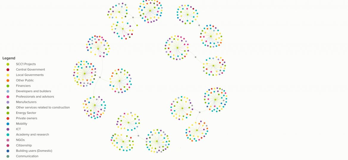
On the other side, we have the projects and initiatives, which is the “what”. The difference between the “who” and the “what” must remain clear in our minds even if in some cases (if for instance they are participated by the same stakeholders), it seems difficult to differentiate a network from a project or an initiative. But for now let’s return to the first orbit of the SCC1 projects and network. The information is gathered in a series of excel spreadsheets (which is the database), and the graphic representation (what we properly call the map, as it allows a more clear visual understanding of the relationships), is done with the KUMU software. We have called this a “constellation” and, indeed it is a numerous population, as the number of participants (which is the specific name of the stakeholders in this case) of the first seventeen SCC1 projects is 534. The following image is a “loose” representation of all the participants at the SCC1 network, which also represents the SCC1 network itself, in a way.
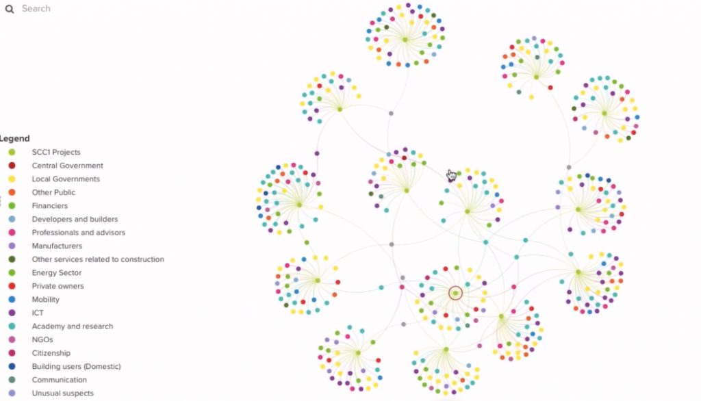
The SCC1 Framework participants “constellation”.
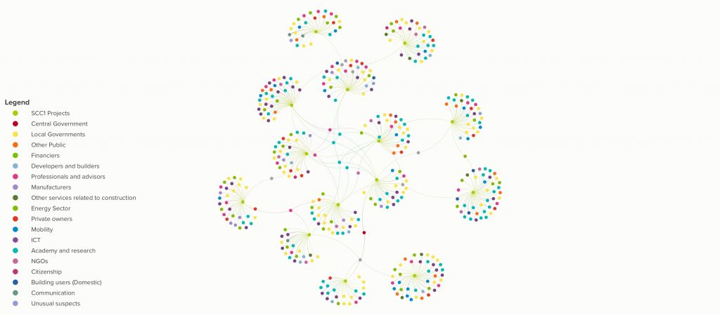
Here we can see different code colors meaning that the 534 participants have been classified according to eighteen stakeholders categories, based on the work developed in previous projects coordinated by GBCe like BUILD UPON. This, which basically represents the area of activity of each participant, is an essential piece of information so this has been incorporated to the database. This leads us to a first clustering, which will allow us to see together all the participants who respond to the same category, for instance, local governments with local governments, or research institutions with research institutions. This visualisation provides a first, clear “map of peers”, and also allows us to see for instance what types of stakeholders are more numerous or more scarce.
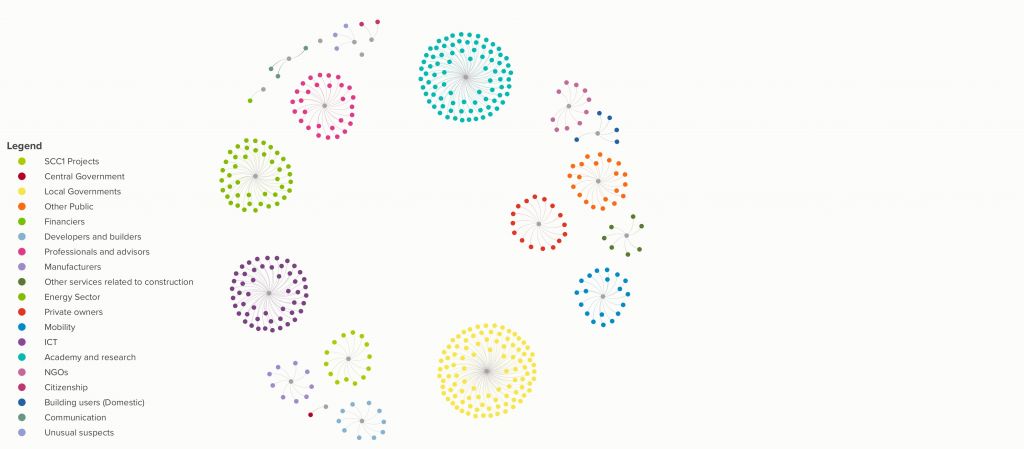
Stakeholder map clustered by stakeholder category.
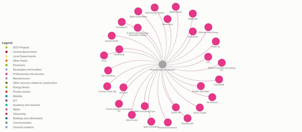
Close up of one stakeholder category: professional & advisors.
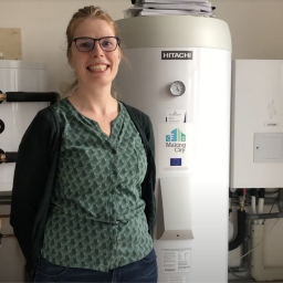
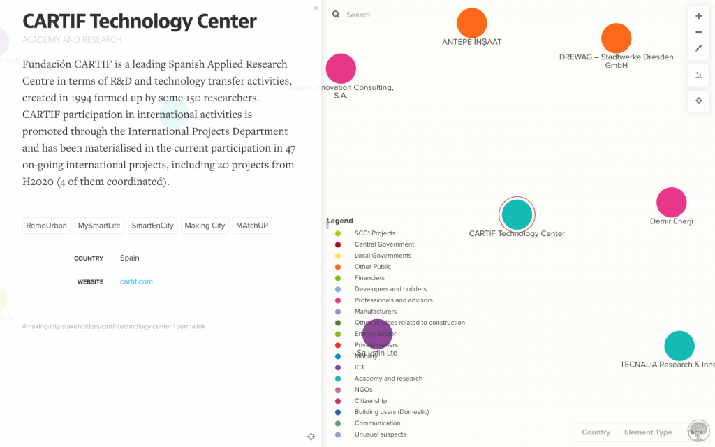
We can also see a succinct description of each participant, which is public information obtained from each one’s webpage, as KUMU allows free use provided the information contained in it is open. Below the case of CARTIF, with a hint of additional information of the projects CARTIF is in.
This gives us a hint of the information we can access, but we want to know more about relationships and connections. Logically, in order to retrieve valuable information in a visual way, the information must be incorporated, and adequately structured, at the database behind it.
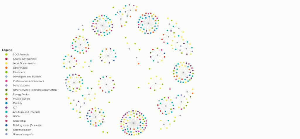
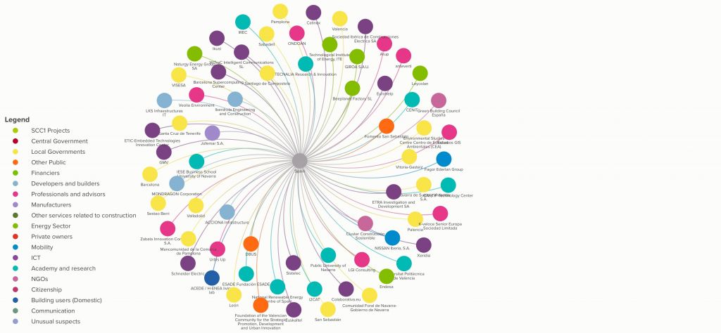
A second most evident map is the one that expresses the relationship between participants and SCC1 projects in terms of in which project a given participant is. In this case the SCC1 framework participants are clustered by SCC1 project.
This gives us some pretty direct additional information which would be difficult to “see” at the spreadsheets: if we visualise all the participants and projects together, we very clearly see if one participant is in various projects. And we can see in more detail the specific participation in one given SCC1 project:
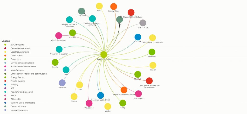
Close up of one project: Smarter Together.
To conclude this first round of visualisation possibilities, as the country each participant belongs to is part of the information gathered at the database, the participants can be clustered by countries, in what we could call a “map of nationals”, which gives a clear view of the participation each county has at the SCC1 network.
And we can see in detail one the participation of one particular country at the SCC1 network.
A good graphic visualisation, as the one we are seeing here with KUMU, is an added value as it provides an attractive image including additional information on the relationships of the stakeholders, (in this case the SCC1 participants), in response to basic, fixed clustering queries. But the participants’ database itself which is kept in the form of spreadsheets, could allow information to be retrieved in response of other queries.